
ORIGINAL ART
-
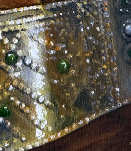
"Textile Study" Original Oil Painting
Vendor:Luca Molnar ArtRegular price $220Regular priceUnit price per -
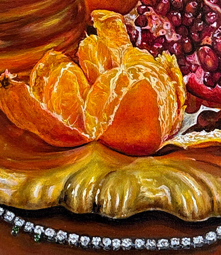
"Guardians of Earthly Treasures" Original Oil Painting
Vendor:Luca Molnar ArtRegular price $3,700Regular priceUnit price per -
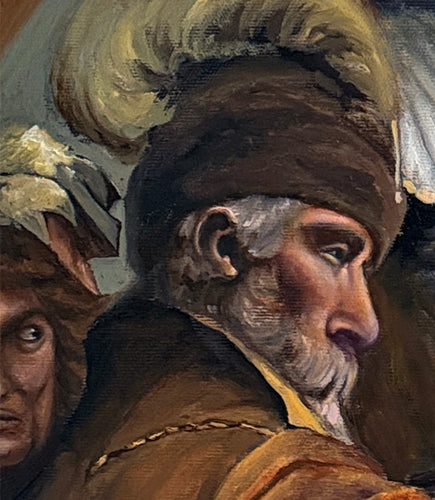
‘Master study’ Original Oil Painting
Vendor:Luca Molnar ArtRegular price $3,700Regular priceUnit price per


Classical Oil Paintings Inspired by The Old Masters
